Be warned: this is an opinion post!
no one asked but here it is anyways! This iteration of “In My Humble Opinion” we’re gonna take a look at a few examples of tacky, outdated, or just plain bad product packaging.

Makeup
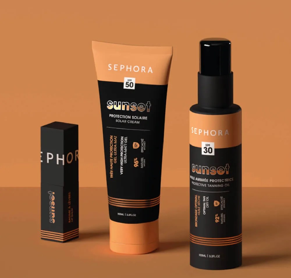
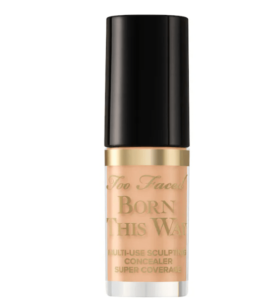
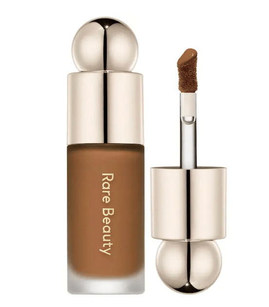
It is so unfortunate that items which are beauty related are some of the worst offenders. I have had multiple experiences of walking inside of a Sephora or an Ulta and an item catches my eye. And not in a good way. A lot of these products look like they could be sold in the TikTok shop for a suspiciously low price. Although, these stores know their audience is mostly on the younger side, so maybe it’s on purpose? I feel as if these products just expect you to know what they are and do; not very beginner friendly.
- 1: Bad readability, why is half of the text one orientation and the other is not??? and the “sunset” logo is not helping.
- 2: Bad contrasting, brownish gold product with gold type on top of it? cmon now…
- 3: Tacky, the container looks like a toy to me. Especially with this horrible font. I will not be taking you seriously!!!
Cooking oils


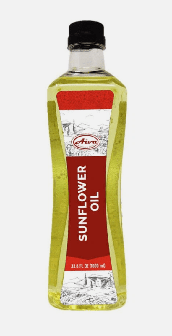
As someone who loves to cook and loves design, I like treating cooking the same as creating art. With that, I expect my tools to look the part! Oil is used in almost every dish imaginable, so why do some companies insist on god-awful packaging? Not everything has to be in a glass container or beautifully illustrated at every turn, but we have to update our products out of the 2000s cmon guys.
- 1: This is very controversial to put on this list! But this is an opinion piece. My gripe is not with the imagery, or text, or anything on the label really. I think that part was done pretty awesome-ly. My quoral is with the plastic package. Graza is a more “mellenial/artsy/trendy” oil brand. Which is fine, but I’d like to this brand adopt a glass container since it leans more towards the “artsy/consious” crowd.
- 2: Are we so for real right now. I do not want to be putting freaking oil from a DETERGENT container into my food!!! It literally looks like they are re-using motor oil containers. Absolutely not, pick a different package man.
- 3: I’ve never heard of this brand, and this is a bad first impression. Why is the text oriented landscape? We have to imagine our products existing in the space where our audience will see it. Oils will be in a groccery store next to other brands; why would we want our potentional customers to tilt their heads just to read what we’re trying to sell?
Honey


Just like all products everywhere, it’s hard trying to stand out in a sea of competitors. Honey is no different.
- 1: Immediately too many words. There is not stream of reading after “Raw Honey”. They are using paragraphs to describe their honey making process instead of imagery or words. Too busy for almost anyone.
- 2: Bleed. The words are too close to the edge of the label. I read somewhere that most people interpret how important a piece of text is based on how much blank space is around it. The more space the more important; it dates back to medival times when paper was a comidity so only printing a few words on a whole sheet would be seen as stupid unless the text is significant. Anyways, the words almost coming off of the label make it look lazy.
- 3: Very iconic container. The bear is very fun very cool very nice. Why ruin it by jamming so much text and detail on such a small label. I could barely recognize the bee in the middle, and the realistic sky behind it does not make it better. The label is too small to fit this much detail; and just like the last example the text is almost falling off of the label. The slightly darker yellow stroke on “Topanga Quality Honey” on an already yellow background is just terrible also.