Tag: writing

  • best fonts to use in your next design free online no glue no borax

    best fonts to use in your next design free online no glue no borax

    A designers most time-consuming hobby is finding suitable fonts. I am no stranger to scrolling on adobe fonts, dafont, or myfonts trying to find something interesting. Here are some that I’ve discovered that will for sure sit in your favorites for all eternity!


    Benton Modern Display by Dyana Weissman and Richard Lipton

    I am a big fan of thin and clean looking fonts, but they must be serif!!! As to not run the risk of being mistaken for a Rae Dunn font #derogatory. The only good thing a Rae Dunn font was in was Poor Things. Anyways, I enjoy this font because its comes in a very large array of styles so it can be used in a variety of situations. We use serifs mostly for body copy so it can be a real treat when we can use different styles of the same font so we’re not so boring!


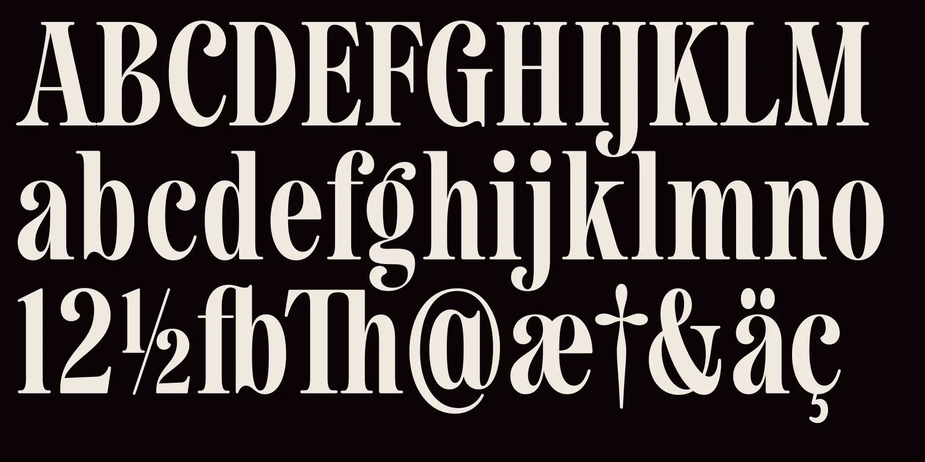
    Luke by Hidetaka Yamasaki

    Blackletter typefaces will always have a special place in my heart. It reminds me of the gothic things that I am very drawn to. This one in particular, just like the last, has several styles. 12 to be exact. And some of them have a fun 2-tone effect (see below). Highly stylized fonts like this only have a number of real-life use cases. Such as word-mark, emphasis, art, or titles. Basically, if we stick within the standards of design we use fonts like these only a few times.

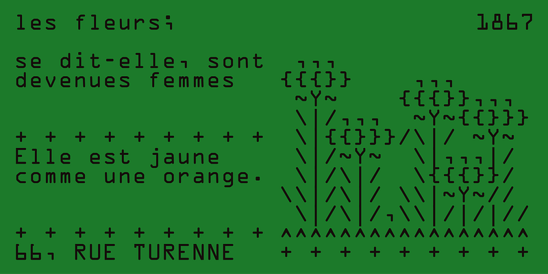
    OCR A by American Type Founders

    Now here is a good mix between style and readability!!! Very cool retro-futuristic kinda look going on here. And I love that the designer included ASCII art they made with their own font! I think this could be used for mostly anything in a design; but still maybe not for large paragraphs of text since it is sans-serif, so it could be a bit harder to read. Playing with the font color is fun also; if we use a black background with green text it could emulate an old terminal. Many fun use cases with this one.
  • what happened to love?

    what happened to love?

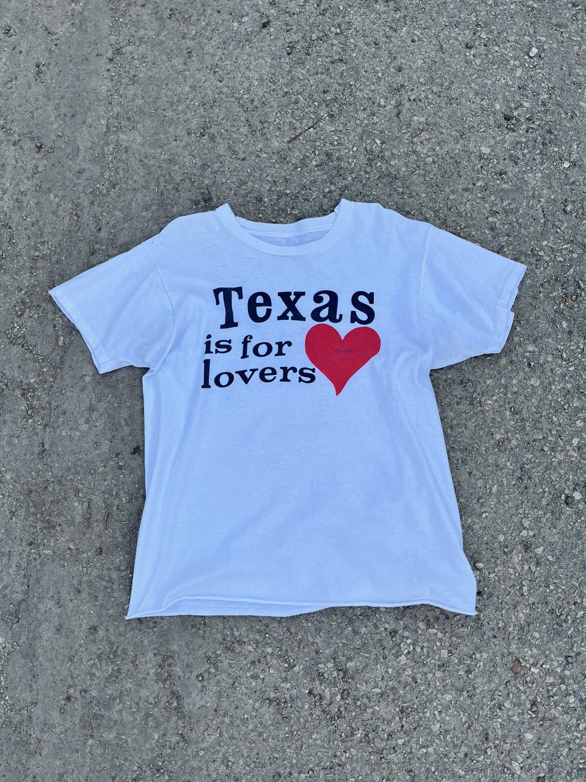
    I miss when hearts were everywhere.


    The heart. A beacon of desire, hope, peace, and of course love. It has seemingly disappeared from business branding in recent years. Is it a relic from the past? Deemed to be “tacky”? Well, I like it! So here’s some of my favorite examples of the heart being used.

    1900s VS Today

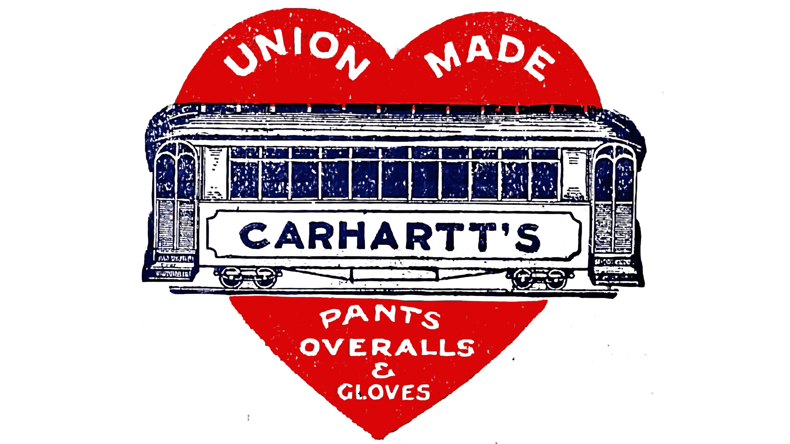
    Carhartt


    Starting off with my favorite. These logo iterations for Carhartt were used on products made from the early 1900s up to the 1960s! They were used for promotional material, clothing tags, and clothing buttons. Nowadays, Carhartt uses this iconography in their more “fashion-forward” line: WIP.

    Elkhart Brass MFG


    While walking around my downtown area I stumbled upon this name plate on the side of a historic building. After researching, I come to find out that this business is still operating in the same city they were founded in: Elkhart, Indiana. Elkhart Brass MFG. manufacture firefighting equipment like the one pictured. I was also pleased to find they have kept the same heart icon behind the elk image in their logo.

    Illustrated by Filip Pagowski

    Polish born graphic artist. Filip studied at the Warsaw Academy of Fine Arts, and soon after moved to New York City to establish himself as a well-respected illustrator.

    CDG PLAY

    Introduced in 2002 by world-renowned trailblazer Rei Kawakubo, CDG Play has one of the most recognizable logos in the fashion world. This clothing line had a GRIP on Instagram and TikTok in 2016; although I like to give it more credit than just a trend from that time. I love the inconsistency of the line-work which is an obvious nod by Pagowski referencing the name of the sub-brand: PLAY.


    all in all,

    I definitely think that todays brands are shifting more towards a “heritage” or “illustrative” type of branding instead of the minimalistic and streamlined design that has been dominating branding for the last decade.

  • punk posters bruh

    punk posters bruh

    Black Flag, 1981

    Henry Rollins with Black Flag playing at Cardiff Top Rank during their UK tour. I watched an interview where Rollins explains that he keeps track of which year a photo was taken by looking at his hair length. Short means early in his career, like in this photo.


    Although this IS a design blog, creatives often take inspiration from those who like to break and bend the rules.


    Slash was a Punk/New wave magazine focusing on the LA scene that was in print from 1977 to 1980.


    Here’s a quick side-by-side of a “punk” poster compared to a more conventionally designed poster. Immediately what is noticed is a more D.I.Y. and rugged feel to the punk style. It intentionally breaks design rules and standards and prioritizes a non-comformist feeling.

    The detail that this style of poster gets right is always emphasizing the bands. By making this one of the biggest items on the flyer it immediately weeds your audience down to: those who know and would like to attend, and those who are curious and are interested in attending. Of course, this sacrafices other details like address, time, and date, which are all the smallest details at the very bottom.

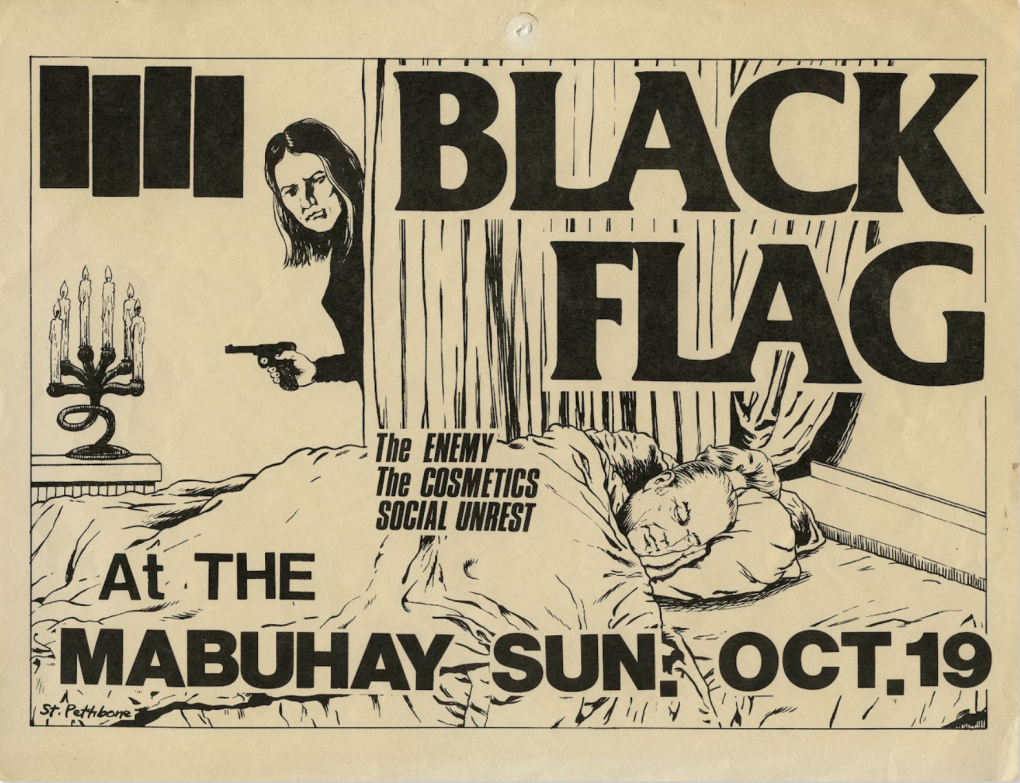
    Raymond Pettibon for Black Flag, 1980

    Arguably the most prolific punk illustration artist to come out of American punk scene. Pettibon made a name for himself by designing flyers for Black Flag, and other SST groups, during their peak years.

    Another important facet of punk flyers is the imagery. Many of these groups opted to hire artists or use their own art, and many times these illustrations are be polarizing. The art above is one of the more tame examples. This again would weed-out those who seek out more extreme versions of music as oppose to those who would rather not listen.

    At its core, Punk, and the hardcore genre in general, is a political movement. All of these flyers call to some type of social issue through its design language; even if goes against all the rules of design. These sentiments range from anti-establishment, anti-war, anti-capitalism, to anti-racism. All in all enveloping the message of:

    All power to all the people.


    Artists I recommend

  • dorm room design

    dorm room design

    1980s Homemade Political Shirt

    Pictured is a political shirt homemade by a person in the 80s with my 90s Pokemon sling bag. I, of course, find the shirt funny and even funnier when paired with the bag.


    Just like everyone’s mom, I love collecting pieces of garbage most people have no interest in.


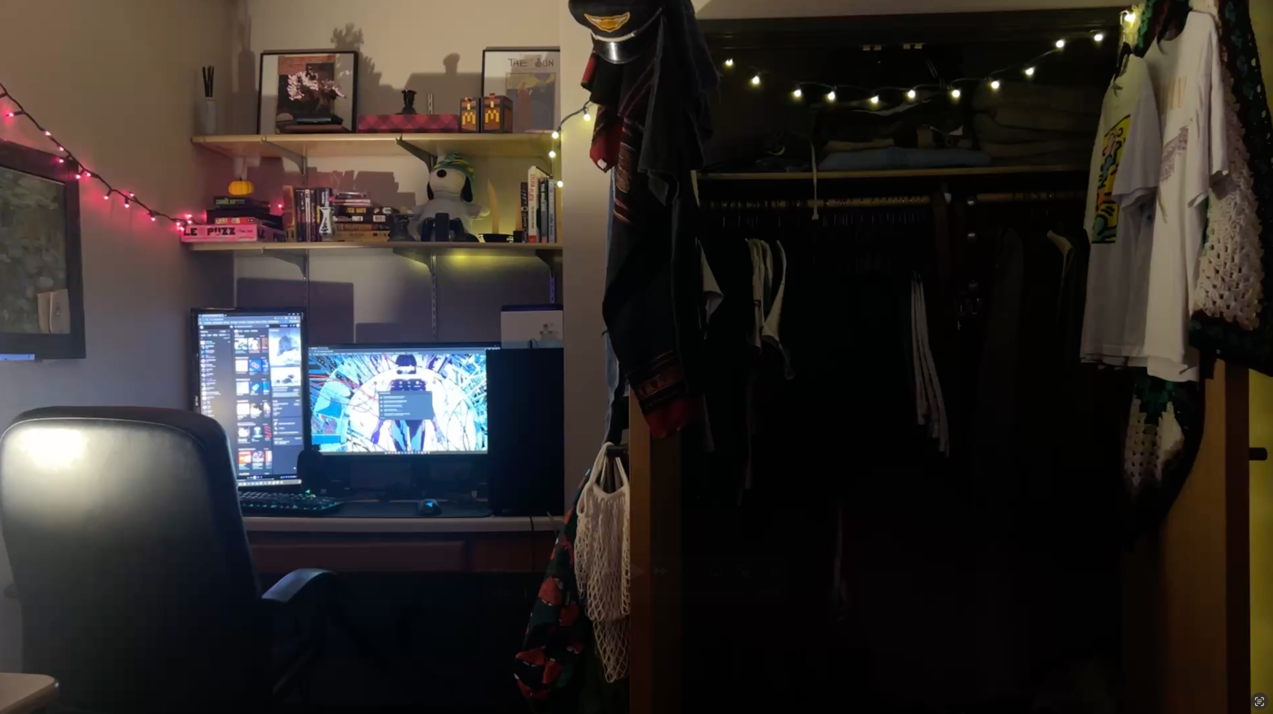
    The bedroom is the sanctuary. The place where people go to decompress and unwind from their day. It must be filled with items that bring joy!

    Shelf collection:
    • Puffer Jacket Snoopy I got as a birthday present
    • VHS/DVD movie collection including: Inglorious Basterds, Pulp Fiction, and Ace Ventura: Pet Detective.
    • Board games and puzzles
    • Differently shaped and colored candle holders
    • Lego Bonsai tree
    • 2 framed French advertisements from the 1920s
    • McDonalds Minecraft Happy meal toy
    • Book collection including my favorite: The Bell Jar by Sylvia Plath
    • Diffuser with scent sticks that don’t even work bruhh!!

    Monet, Van Gough, and Matisse. I like to fill my space with artists like these for inspiration. I don’t like the look of locking these paintings behind a glass; it kinda ruins the immersion for me. I’m a tactile person that loves the look of imperfection and texture.

    I think that if someone caught a glimpse of my room in passing they could safely assume a number of things about me; and they’d be right about most of them.

    I like my room to be well-lived in, but still neat and organized enough to not drive me crazy!


    Maybe not what you expected.

    Especially if you’ve seen me walking around IRL. As I tend to dress in all black, but MCM design has a special place in my heart. And I’m not going to stifle my love for certain things just because they don’t fit my “aesthetic.” Periodddddddtttttt.