
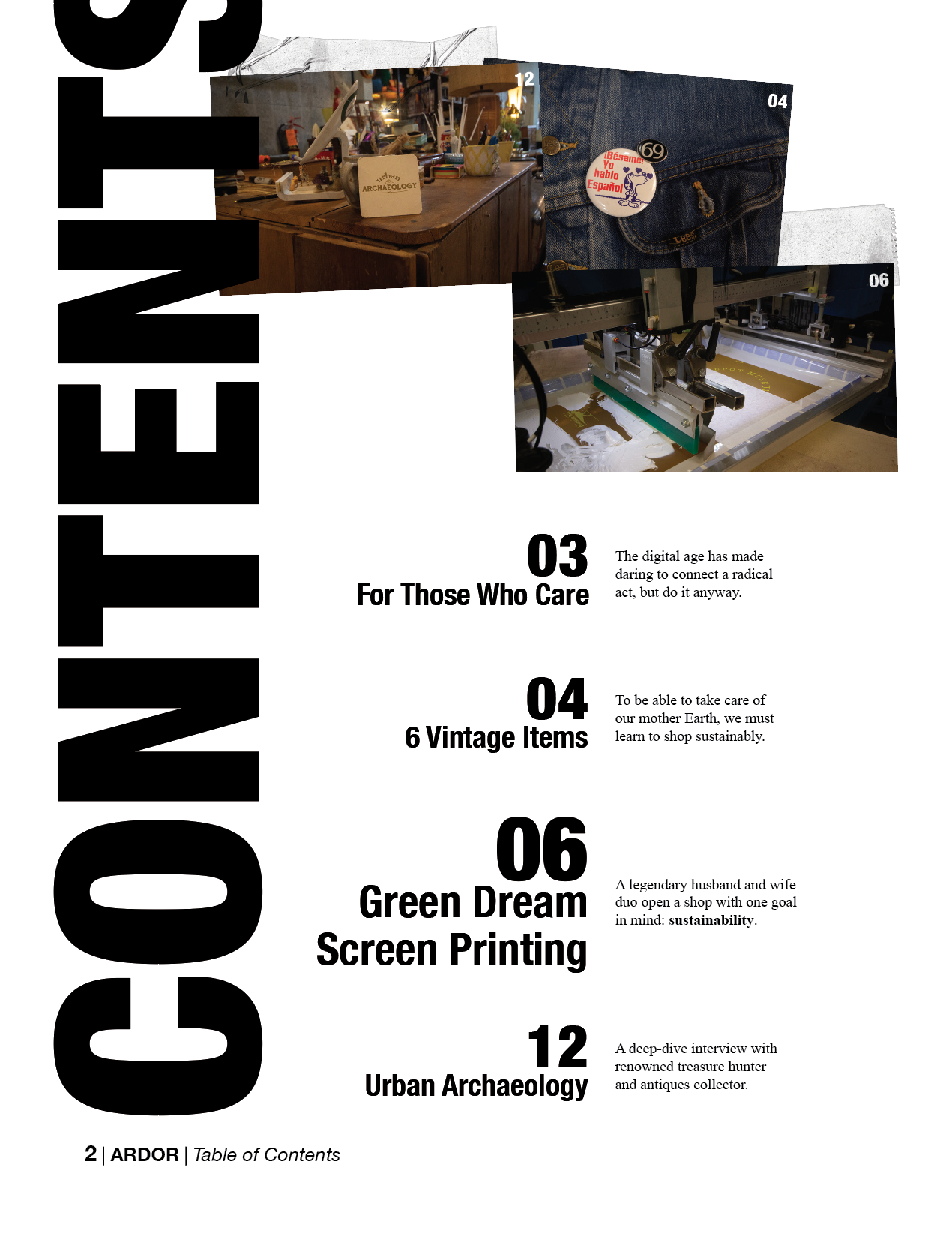
For the creation of the table of contents of my magazine, I kept the same inspiration for the front by keeping it clean, powerful, but unique.

I love when elements go outside of boundaries and break the typical box that designers feel constrained to. When doing this there’s a fine line of including enough of the element. We must keep enough of it in to make sure the point goes across clearly to our audience. That’s how I decided to know where to cut off the word “CONTENTS”.
As for the chapter descriptors, the interview with Green Dream is the main point of the article so I emphasized its importance with weight and size.
One of the main reasons I love Helvetica Neue is because of how many styles it has. I’m able to use it throughout my magazine to define the importance of different parts, and keep it all tied together at the same time.

To keep with the DIY theme I added a tape texture to the photos that go along with the interviews I conducted.