
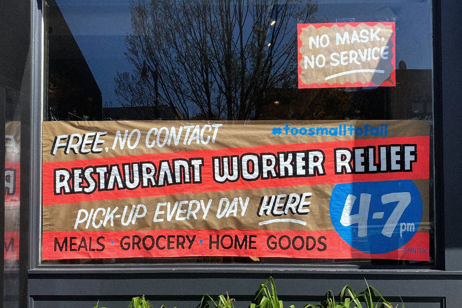

NYC has been around for a while. Many parts of the city have been demolished, rezoned, and rebuilt. But, there is a certain aspect of the city that has survived modernization: Hand-painted signs.
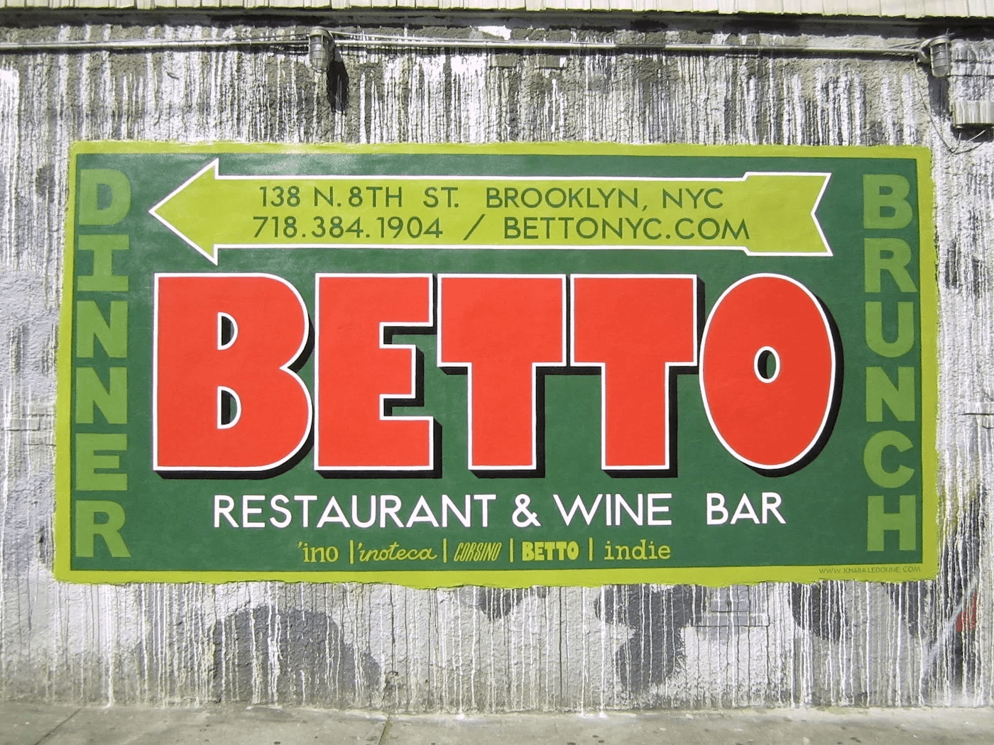


There is so much character oozing from these signs. Each and every single letter is perfectly imperfect! It’s artisanal typography at its best. There is such a lush history of art working in hand with business in NYC.
Its very essence is human.


I think that’s why, when Zohran’s designers were drafting up his campaign look, they decided to draw upon that exact thing. It coincides with his platforms and puts him next to the workers.
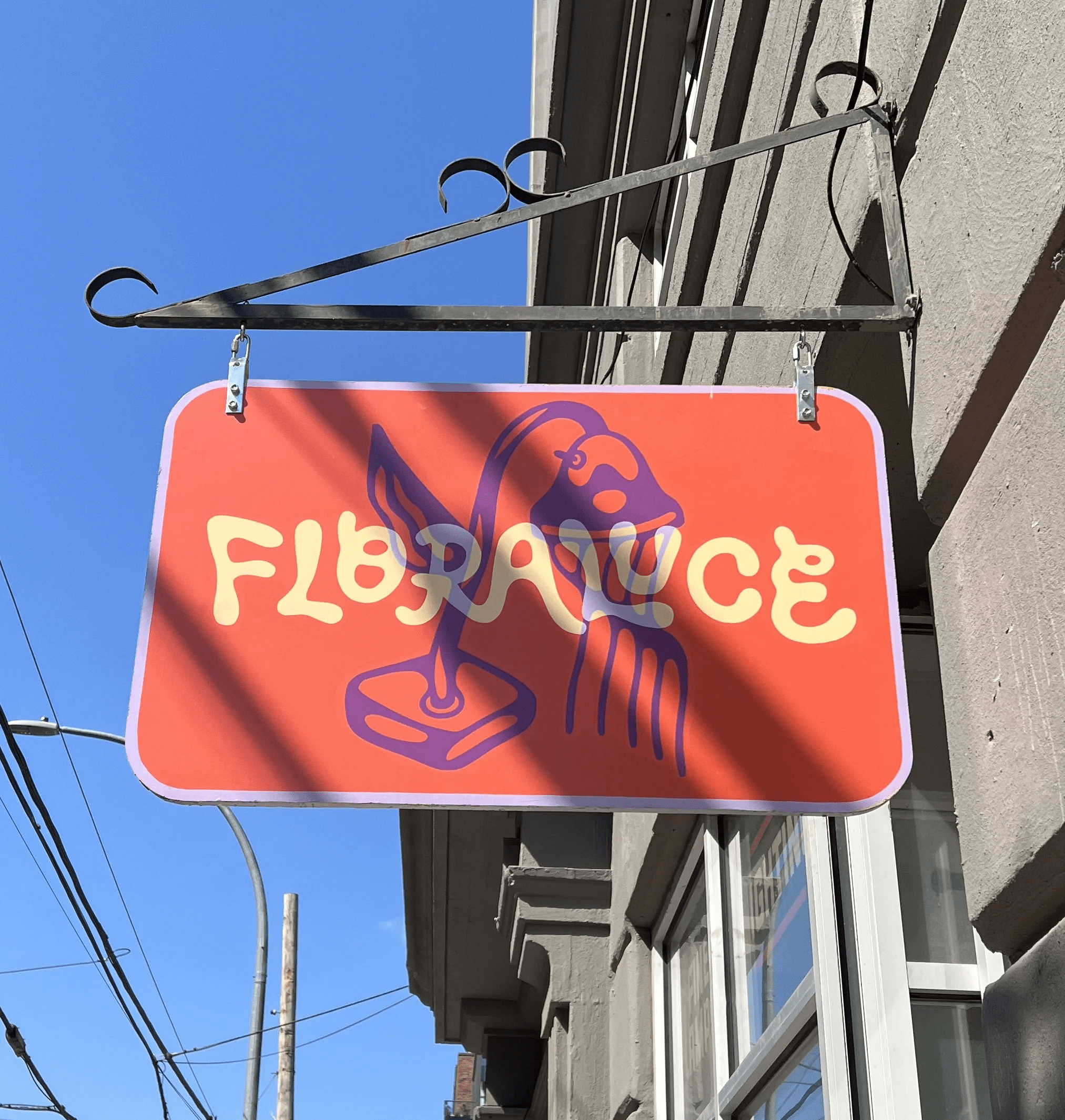

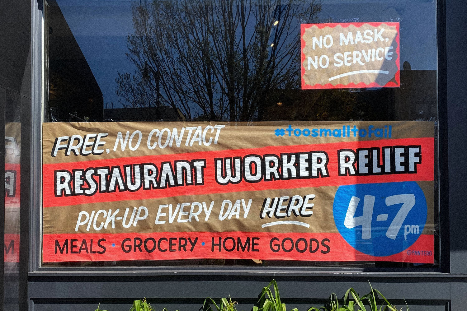
I see not only NYC, but the entire design landscape, heading into a more artisanal look. Things that have intentional imperfections imbeded into the design-code. This is absolutely being catapulted by A.I., but I also believe that the consumer-base is just tired of corporate-slop. Only time will tell, but I’m here for it.