
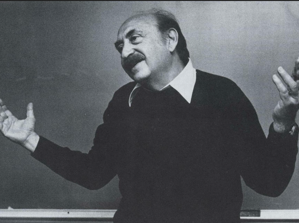
For those who are keen on researching designers, Saul Bass is absolutely of the greatest to ever do it. He is best known for his corporate logo designs, many of which are still used today in some capacity. But his talents stretched all the way into the movie industry.

Saul Bass was born in New York City on May 8, 1920. He studied design at the Art Students League in Manhattan as well as Brooklyn College. When graduated he opened his own design firm.
He started in the movie industry by designing advertisements for films coming out during the 40s/50s. While working in this field, he created the first title sequence to set the tone for a movie, which was for the film Carmen Jones. This catapulted his career into stardom.
Corporate Logos

All of these logos were designed by Saul Bass. Almost all of these are still used in some capacity today. This just goes to show how good of a designer he really was. My personal favorites include: Girl Scouts, AT&T, and Dixie. The Girl Scouts is especially good! I just love the motion and dimensionality of it. These logos are timeless, since they rely on vibes, emotion, and/or simple shapes to create a story and not on trends.
Movie Posters

During his career, Saul Bass designed many influential and eye-catching poster. His most popular are pictured here in this grid. The shining poster is arguably his most famous. Throughout all of these you can really see his style emerge in the essence of simple shapes, bright contrast, and a hand-done look and feel. My personal favorite is of Bill Wilders’ One Two Three.
Title Sequences
As mentioned earlier, Saul Bass’ career was really cemented by his creative title sequences for films. He really was the fist to ever make these once boring showing of names into a mini-film of its own. Stirring up the emotions that the viewers will feel during the movie. Here are some examples of his work: