
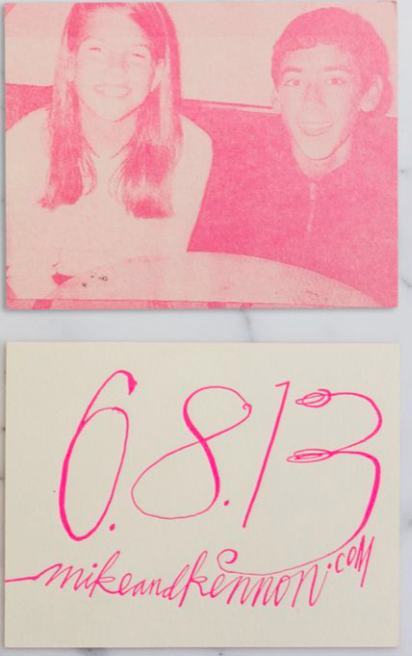
greetings and salutations readers from wherever you may reside. If you’re reading this, you’re in luck! I’m about to lecture you on your screentime! I don’t think you’ve heard enough from other people on that im sure… It’s pretty easy to get caught up in our digital worlds, especially as designers. But getting inspiration doesn’t just have to come from mood boards and scrolling. I think taking a break and even just having a look around your abode can recharge your mental state. Go through your mail maybe you’ll find some unexpected gems in there! Maybe you’ll find some interesting looking… wedding invitations? Well, if you have cool friends you will…
less is more

we hear it time and time again, less words less colors less lines means more meaningful designs! and its true! If you’re sending a wedding invitation to someone you, hopefully, already know them very well!!! They don’t need to know all that extra stuff! Date, Place, Time, and dress code. I especially love the above design! Using a handwriting for the details makes it so much more personal. Plus they’re directing you to a website where you can find all of that extra stuff no one cares about! Genius! We can use this space for… nothing! because it looks better that way 🙂 Also including a photo of them as young teens dating is so cute, and a color overlay to match the color below is smart!
memorable, for the right reasons

I love that there is a resurgence of people who desire physical media! I think the feeling is there for all people at all times, but needed to be awakened. I’m not sure as to the expense of having personally stitched handkerchiefs like this, but just imagine how cool it would be. We want to give people something pleasant to look at and also interesting enough to remember. Something like this turns the idea of a wedding invitation on its head, its in the same realm of it, but not too far removed where its weird. Its reminiscent of promotional cocktail napkins. I like stuff like this. If I ever received something like this I would frame it!!
elevated classics

There is nothing wrong to sticking to something that is proven to work! I do think that there is something wrong in not updating it making it yours though 🙂 This is such a classic save the date but elevated in the exactly right areas! We got: nice feeling paper stock, amazing color combinations, perfect font choices, and not putting more information than needed. Having the text go outside of the box is also very just mwuah! It keeps it modern, but not over the top!!! I love when people keep it simple and cool.