
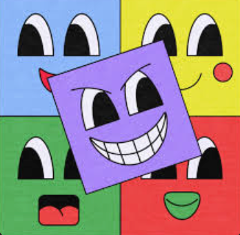

So many of todays brands try to emulate the look and feeling of nostalgic playfulness with little success. There are relatively few that are able to match that emotion and even fewer that do it while still keeping it interesting. This is why I love Little Troop. They capture all of those aspects while putting their own twist on it. Their designs feel familiar yet innovative. So let’s take a look at a few of their projects.

Little Troop Inc. is a design studio founded in 2019 by creative directors Noemie Le Coz and Jeremy Elliot.
Le Puzz

This is their most recognizable project to date. Le Puzz is a puzzle company that encapsulates the energy of those weird puzzles you’d find in your grandma’s house along with the youthfulness of vintage cereal boxes. Little Troop took full control over branding, illustration, packaging, and general art direction.

Their typeface choices is just *mwuah* chefs kiss!! They utilize Winchester for the logo along with Helvetica Neue and Times Now for their copy. What I love specifically about is is their use of not only different weights, but purposefully stretching out the letters to achieve a more random playfulness feel. Absolute masterclass on how to keep font choices low, but still interesting.
MoMA Family Festival

One of their most recent projects was in collaboration with the Museum of Modern Art to promote a exhibition celebrating creativity and the natural world. This time Little Troop was in not only in charge of the identity, but also the campaign roll-out.


I personally love the illustrations done in this project. This was more of a family/kids oriented job, so how do we convey the message of creativity and inclusivity through nature to kids? They make these other-worldly characters and combine colors we’d think to see on other planets ecosystem. Of course! Great world-building, great color choices.
Rocco

This campaign was for a smart fridge! Little Troop was in charge of the brand identity of the company and the art direction for their first product.


Now this campaign was a little more tame and tailored compared to the other ones we’ve reviewed, but Little Troop still finds way to inject their youthfulness into it. We can see this with their logotype. It’s sleek and minimal with just the right amount of flair and personality to it to where it doesnt feel out of place next to the product. And we can see this sort of style from their website as well. Polished sans-serifs paird with proffesional serifs; All while keeping it engaging by playing with the kerning and weights. The imagery used throughout also keep this idea going in the form of tidy rooms with fun color splashes.