

Every year, Southeast Technical College hosts a portfolio show for the media communication majors to strut their stuff in front of potential employers. Every year, the graphic designers each design their own identity for the show and vote on which will be used.
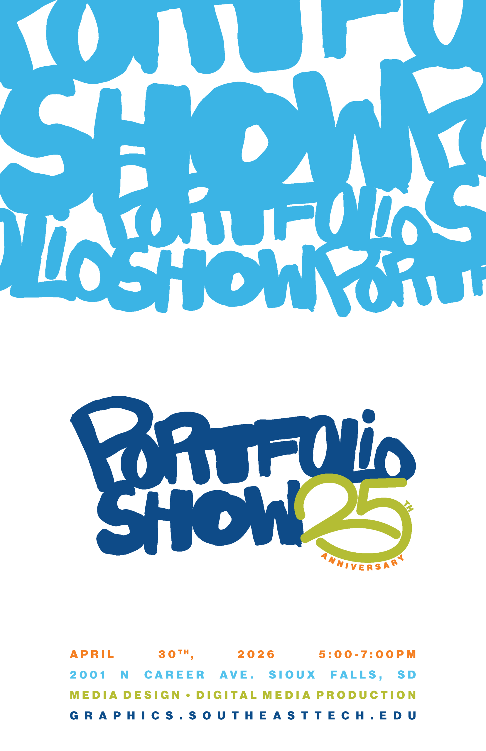
We’ll be looking more in-depth at the poster I designed and the inspirations I drew from.
Writing down the major themes/insights/vibes for the campaign helps me organize my thoughts. Poster ideas always come to me first, so I had these drawn before my logo was complete. I enjoy messing with the square-ish format of posters by having items overhang or go past the borders/margins. It adds depth and breaks the viewer out of the box. I focus on depth, texture, and imagery.


Inspiration
Keith Haring is always an inspiration for me; I love his art and how he used his platform to promote causes he truly believed in. His early work is especially interesting to me. The way he developed his art style, around speed and intentionality, is amazing!!


His line-work collages really spoke to me.


Here are some early poster designs that I whipped up after creating the logo. These are some early renditions of the sketches I drew out earlier in the process. Ultimately, I decided to play off the overlapping of letters from my logo like in some of these examples.
I took the letterforms and words from the logo and set them next to each other in an overlapping manner. This gave the sense of “huge body of works”. A “sketch” and “artisanal” vibe with still a sense of naivety.
I also angled the shapes at the top to form a subtle curve to lead the eye to the rest of the poster. To contrast the hectic top-half, I set the information in a nicely justified square. I did not want to introduce more line-widths, so instead of using the different font weights, I used the colors available to me to split up the information.
I also set the size of the type to match the size of the logo, but spaced them all equally from each other in a large white space to convey equal-importance!
I love how this poster turned out; definitely one of my favorite parts of this campaign.