
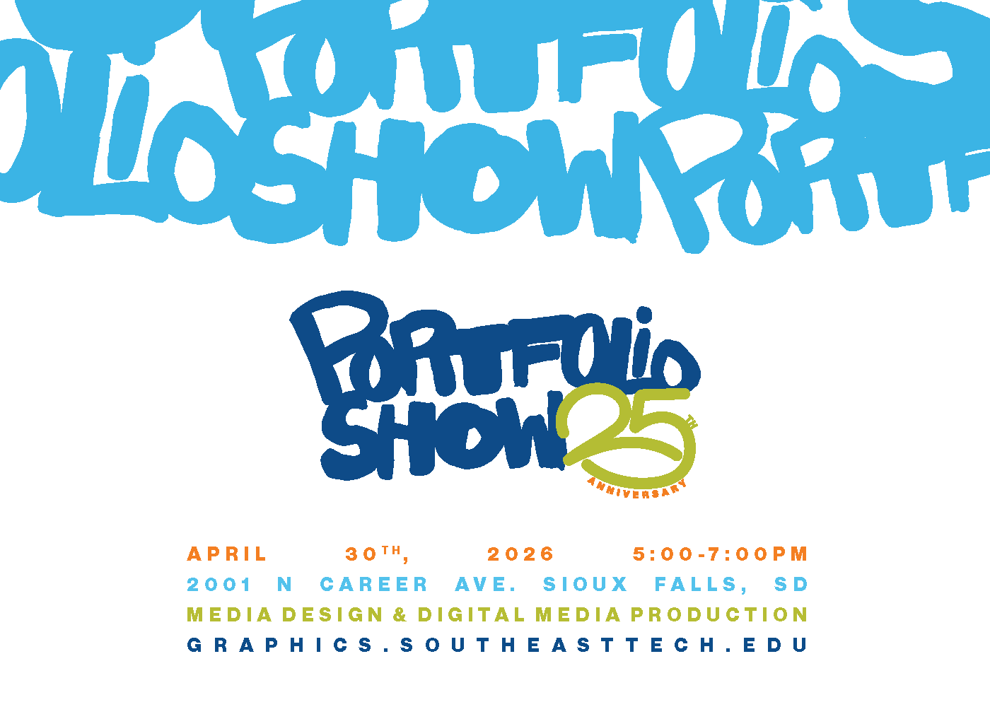

Every year, Southeast Technical College hosts a portfolio show for the media communication majors to strut their stuff in front of potential employers. Every year, the graphic designers each design their own identity for the show and vote on which will be used.
We’ll be looking more in-depth at the invite I designed and the inspirations I drew from.
The proposed envelope cannot be designed on top of since it would be going through the mail. So, we get creative where we can!
Adding the logo on top of our address gives the viewer a clue as to what will be inside.
If we know the name of the business/person, then we would of course use that, but if not, then I enjoy “Cherished Guest”. It’s warm, inviting, and respectful.

The poster is the main basis for the rest of the media that will be put up/mailed out. We just resize and adjust as necessary.
Here, since our canvas is more square than rectangular, we squish everything down.
I made the logo less wide than the text box at the bottom to make sure that the text is legible, but we can also use that to our advantage by putting the logo in a white space, just like the poster. This commands the viewer’s attention without adding more visual noise.
We scoot the top words up so as not to make it top-heavy.