
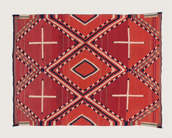
DETAIL IS COOL!
COLOR IS NATURAL!!
BROAD APPEAL KILLS CONNECTION!!!
Too many brands rely on simple “impactful” designs. This type of imagery, iconography, and branding really create no relationship between the product and consumer. And since almost every brand is copying off of one another they all get drowned out in a sea of line art and modern fonts.
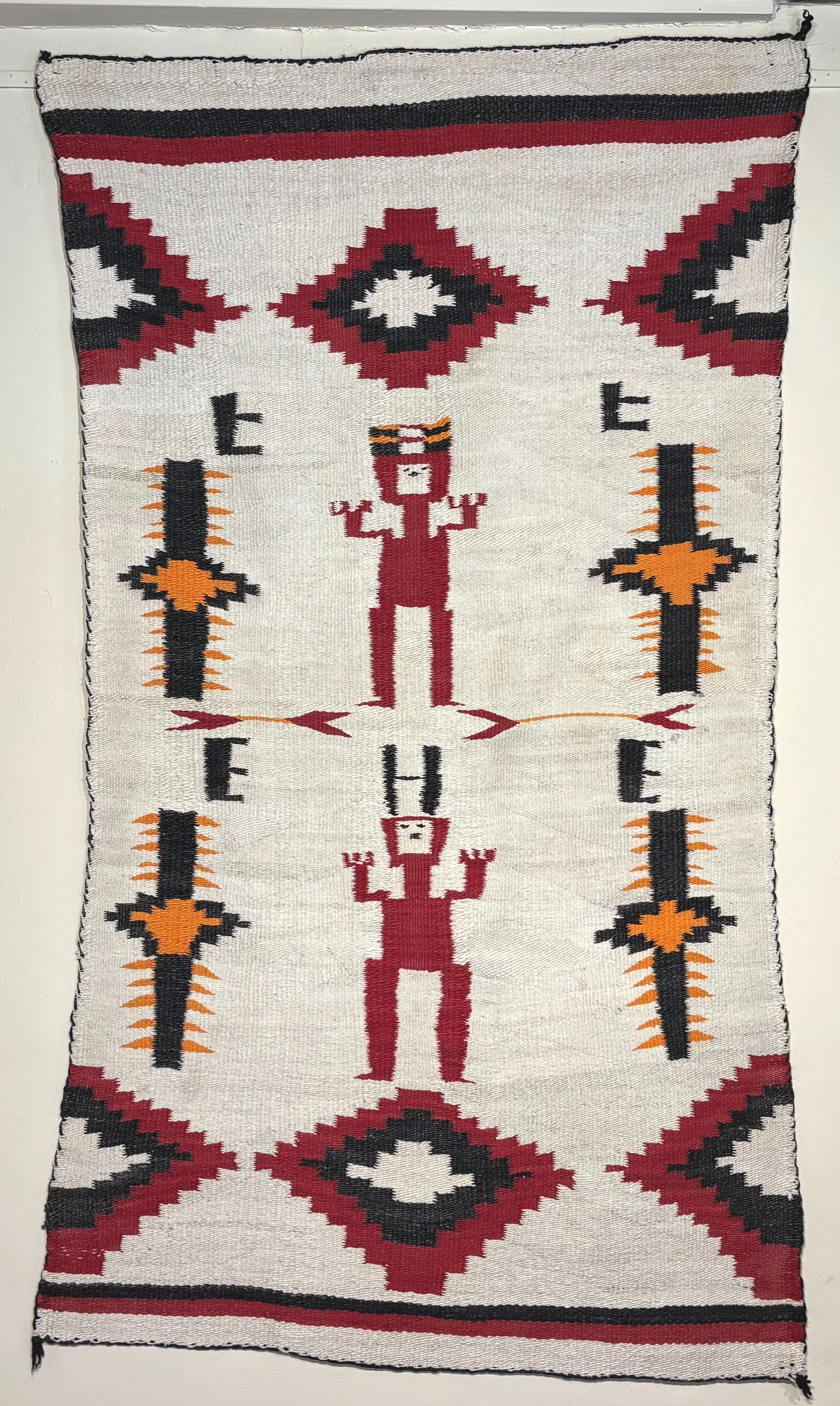
I really do believe that having a niche and creating a community around YOUR SPECIFIC design language is the best possible way of running a business. You basically make your own little cult! Here are some brands that I think are killing it in the category.

KAPITAL
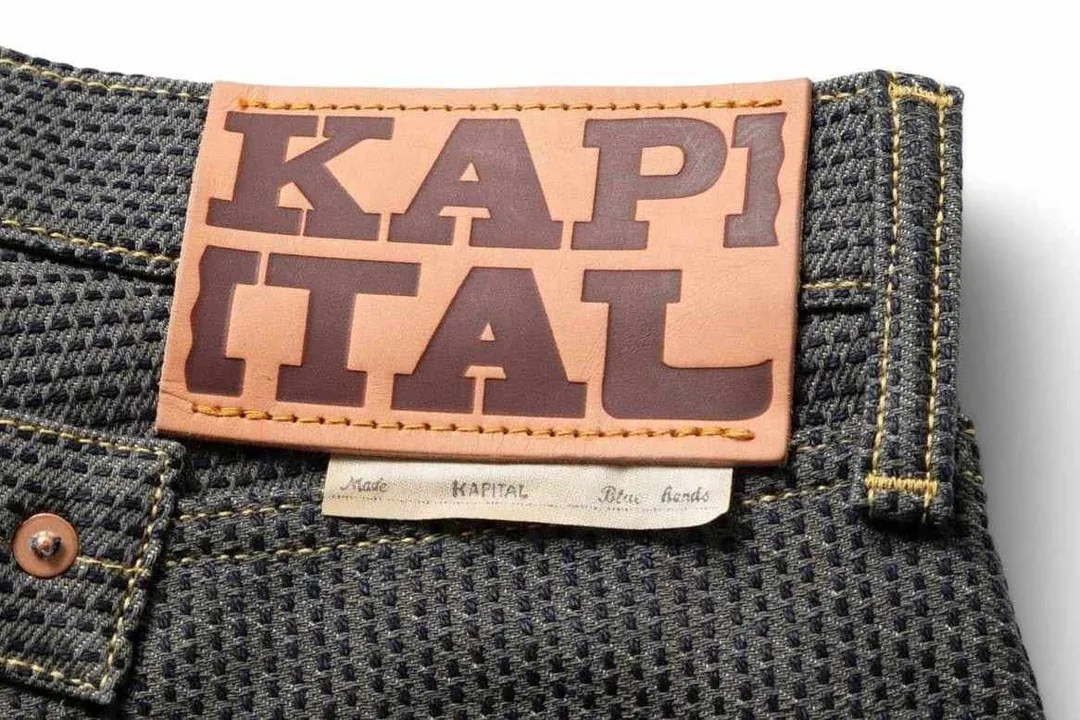
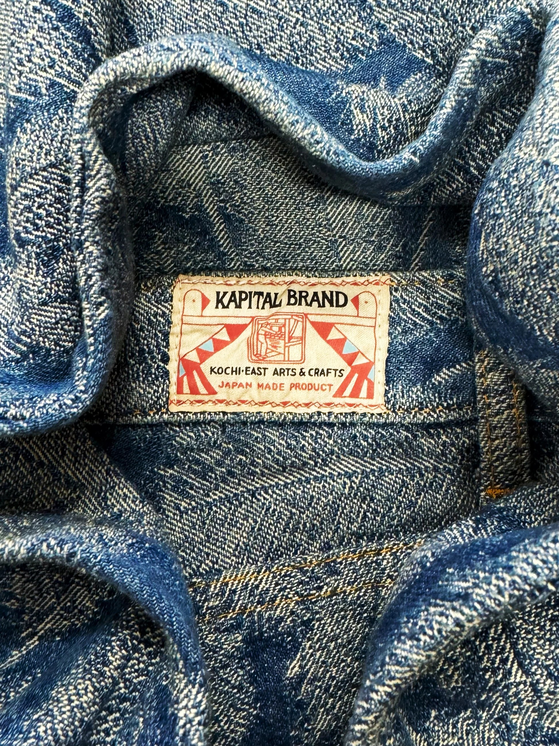
Kapital is one the most renowned Americana clothing brands. This Japanese label started out in 1985 and blends the American workwear styles with traditional Japanese craftwork.

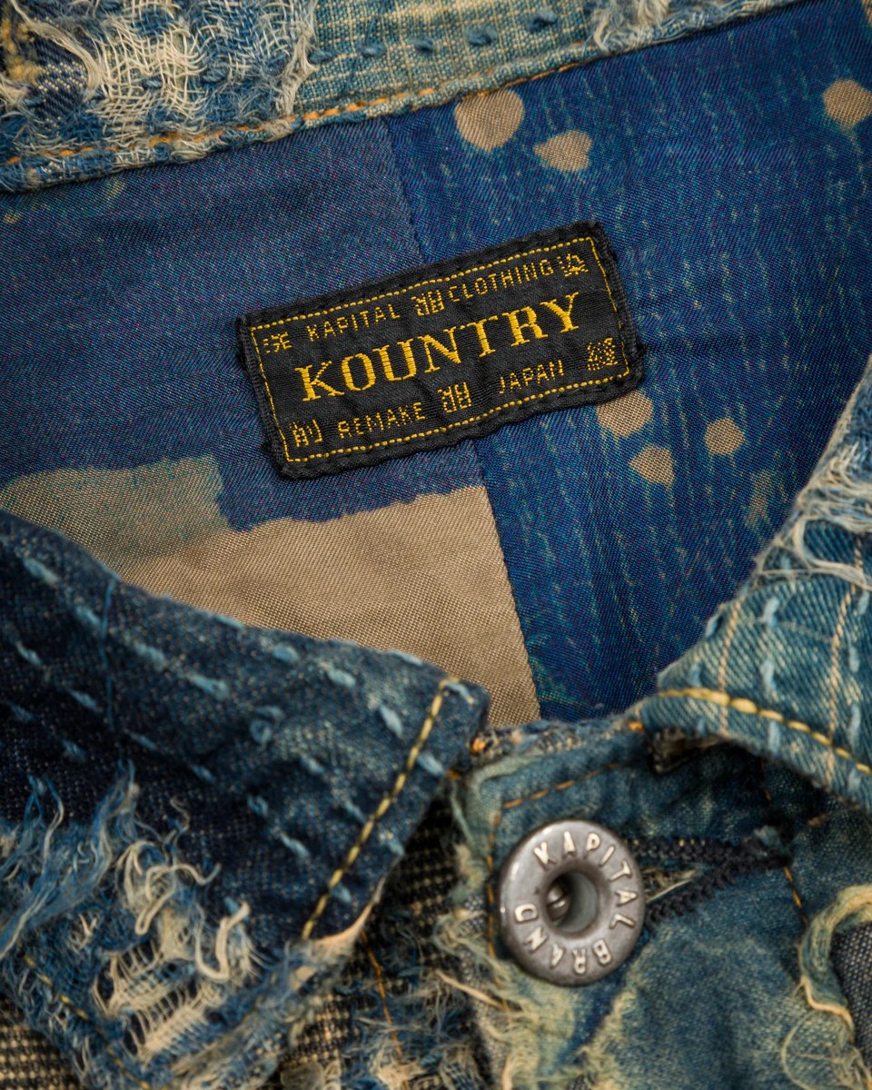
They have such a strong brand identity that if you looked through one of their look-books from the 80s you’d be able to identify a piece of their clothing from this years collection. A strong factor at play to achieve this is keeping the same vibe and not swaying too far into trends or away from their core message.

and just look at how cool their tags are:

LE CREUSET
French cookware company Le Creuset has been doing it right since 1925. They still do business out of where they were first founded and headquartered: France. And their claim to fame, the Dutch oven, hasn’t changed too much in appearance since then either.

I think that they have the strongest example of the importance of forming a community on this list. Their dishes aren’t cheap, some costing upwards of $400. They made as heirlooms to be passed down in your family. So why do people keep buying multiple? Precisely BECAUSE they’re made to last. You can still find models from the early 20s and 30s on the second hand market today! The community of diehard fans collect multiple colors of multiple sets just because they’re so good.
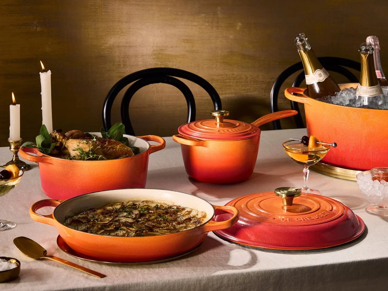
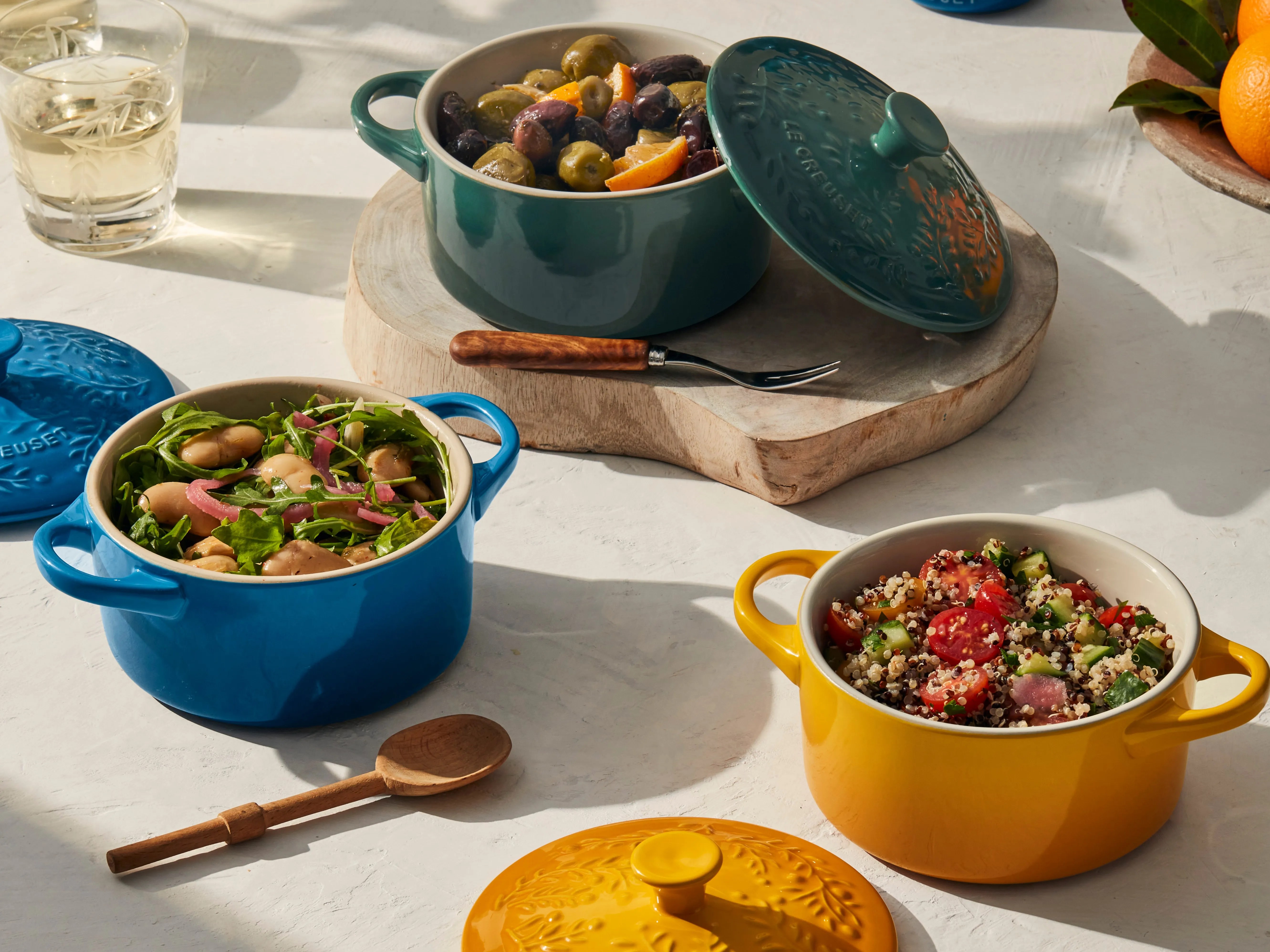
The way these dishes are advertised is in a homey, natural, culture-rich sense. They know their audience, and they know their audience knows them. They play into their own branding by displaying their sets next to classic dishes and artisanal decor.

HARLEY-DAVIDSON
Probably the most vibe-heavy brand on this list. Surprisingly, Harley-Davidson motorcycles has been around longer than the other 2 brands! Officially founded in Milwaukee, WI on 1903, their first motorcycle was made just a year later.

Harley has a very strong connection to the classic American rebel lifestyle and culture, even from the early days. This is the reason why their branding closely follows the format of “don’t fit in” or “live free, ride free” slogans. They were used during both world wars, so naturally they were associated with reliability and combat-ready.

Helping keeping their community strong is the Harley Owners Group. This organization helps build a relationship between not only the brand but also the consumers with other consumers.


A strong brand identity is further established through their marketing and designs. These patriotic, rugged, and heritage style designs push the identity further. Those who wear Harley-Davidson almost always look like they would ride a Harley-Davidson.
Of course its harder
especially for new, up and coming brands to be able to establish themselves like these other brands that have been around for decades. And of course not everyone wants to have the vibe of old, traditional, or heritage. Thats completely fine! But there is still so much to take away from brands like these. Attention-to-detail, curation, community-building, vibe reinforcement, and story-telling just to name a few things. All in all, caring about the product you put out and how the end-user experiences it will always earn you brownie points in my book.