
When researching for a project, I came across a trove of eye-catching magazine covers. Some were from fashion-oriented, and others were youth culture filled. Here are a few that caught my eye.
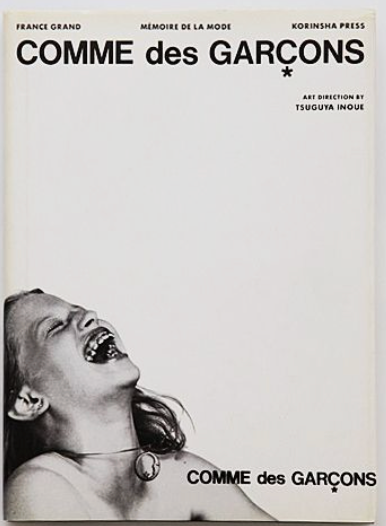
COMME DES GARÇONS by France Grand

This magazine features the work of the work of the trail blazer Rei Kawakubo with her brand CDG. Copies of this were first printed in 1998, and are extremely collectible today. I absolutely love Rei and her work, so it comes as no surprise that I love this. I feel it captures the energy she put into her work very well. Comme des Garcons translates from French to “Not like other boys.” Rei’s work is very dark, almost entirely black, but still maintains a sense of playfulness. I think that the cover for this magazine translates that well with the muted color scheme and the image of a child laughing. Absolutely astonishing!!!
i-D Magazine

i-D magazine has some really very cool covers. I especially like their Bjork ones, but this one in particular I always seem to come back to. They are a fashion magazine focusing on music, art, and youth culture. This specific issue was from September of 1994. The font use may give it away, but I still believe that this is a timeless design. Even with the bright colors, and experimental layout. I would see this while scrolling on Instagram and believe it was designed today. I really enjoy the use of the black space from her hair to put information. I also think the color choices are superb, especially taking into account the emotion coming from the photo and that it is a portrait of Bjork. I think the use of the circles above her name to tie into the circle above the J is genius. 10/10 from all around!!
SLASH Magazine

I wouldn’t be able to live with myself if I didn’t put Slash somewhere on this list. Just an absolutely iconic cover that still influences A LOT of people today, including me! They were short-lived in the LA punk scene but helped define the punk subculture and music as a whole. Probably most famously used as inspiration for Playboi Carti’s album Whole Lotta Red. It’s just incredible what they were doing in alternative scenes in the late 70s and early 80s. My favorite details are…. ALL OF IT!!!! The color contrast of the black and red. The black and white photocopy of the woman and her expression. The font choices and pairing. So much good came from this and will continue to come from this. Ugh, I can’t get enough of it.