
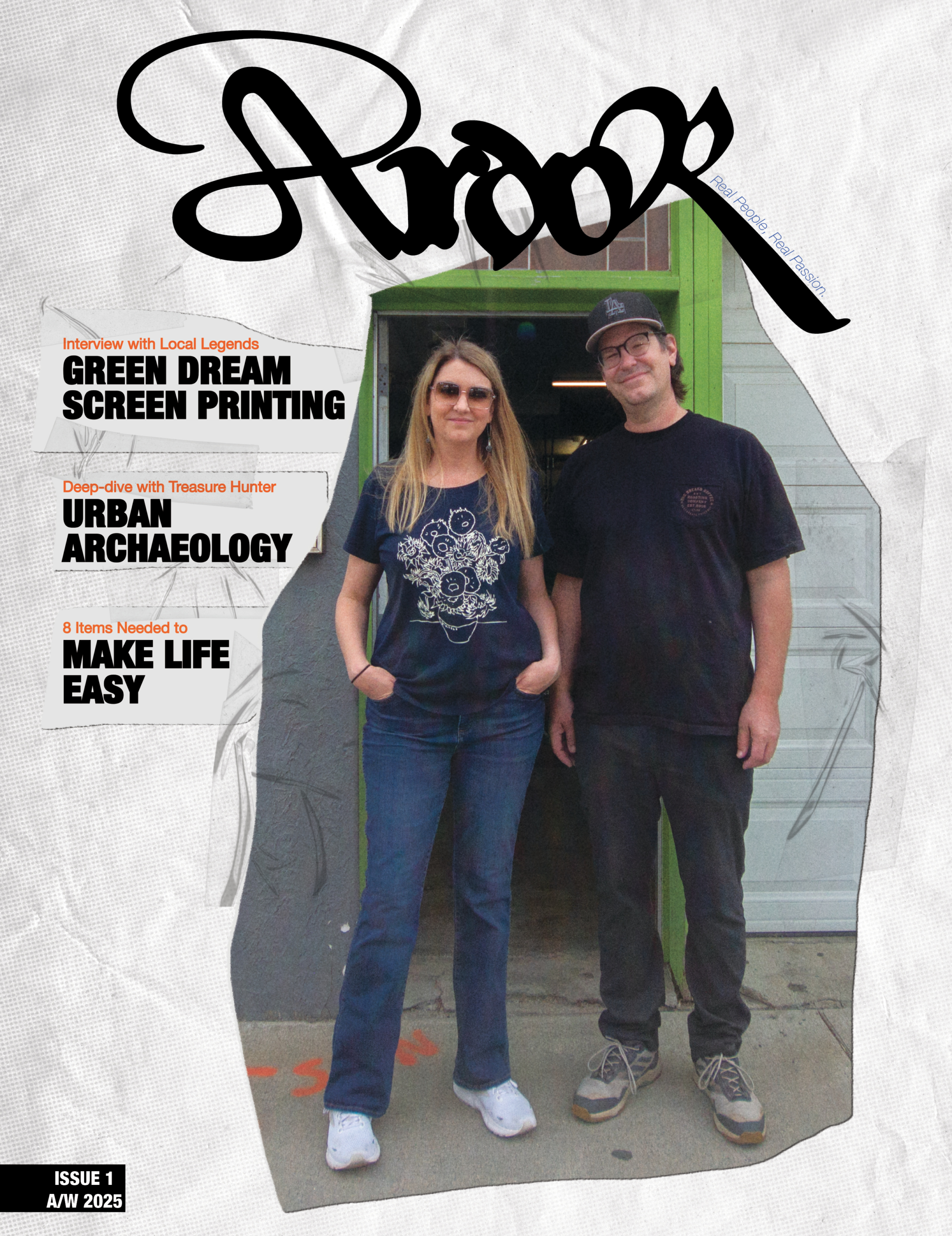
During the creation of my magazine, Ardor, I went to every designers favorite place to look for inspiration: Pinterest. I found a lot of very cool covers and took note of details that particularly drew my attention to them. The covers for big fashion house magazines especially caught my eye. They were clean, powerful, but unique. I decided to make my own iteration of those types of covers.

For the theme of the magazine I wanted to go with a scrapbook/DIY sort of look. So I added a paper-cut effect to the edges of the photos and also tape and paper texture. I kept it clean by limiting myself to the font for the name of the magazine, and, of course, Helvetica Neue!!

Here were some first drafts for the name. I really liked the movement of the capital R on the second option. So I took it and modified it to fit with the rest of the lowercase letters. It also made a good spot to add the tagline for the magazine: Real people, Real passion.
As always, I had lots of fun designing the cover. I can’t wait to finish it to see the complete project!!!