

Every year, Southeast Technical College hosts a portfolio show for the media communication majors to strut their stuff in front of potential employers. Every year, the graphic designers each design their own identity for the show and vote on which will be used.
We’ll be looking more in-depth at the website and Facebook timeline I designed and the inspirations I drew from.
Inspiration


Strangely enough, I get a lot of website inspiration from clothing retailers. Probably because I love to shop, ha. I really enjoy the UI/UX choices of websites like Unsound Rags and Acne Studios. Having a huge images that take up almost all of the screen real estate puts a certain importance on the work. And to contrast these huge images, we have small type. Which equally conveys its own importance in a sea of white space.
Facebook Timeline

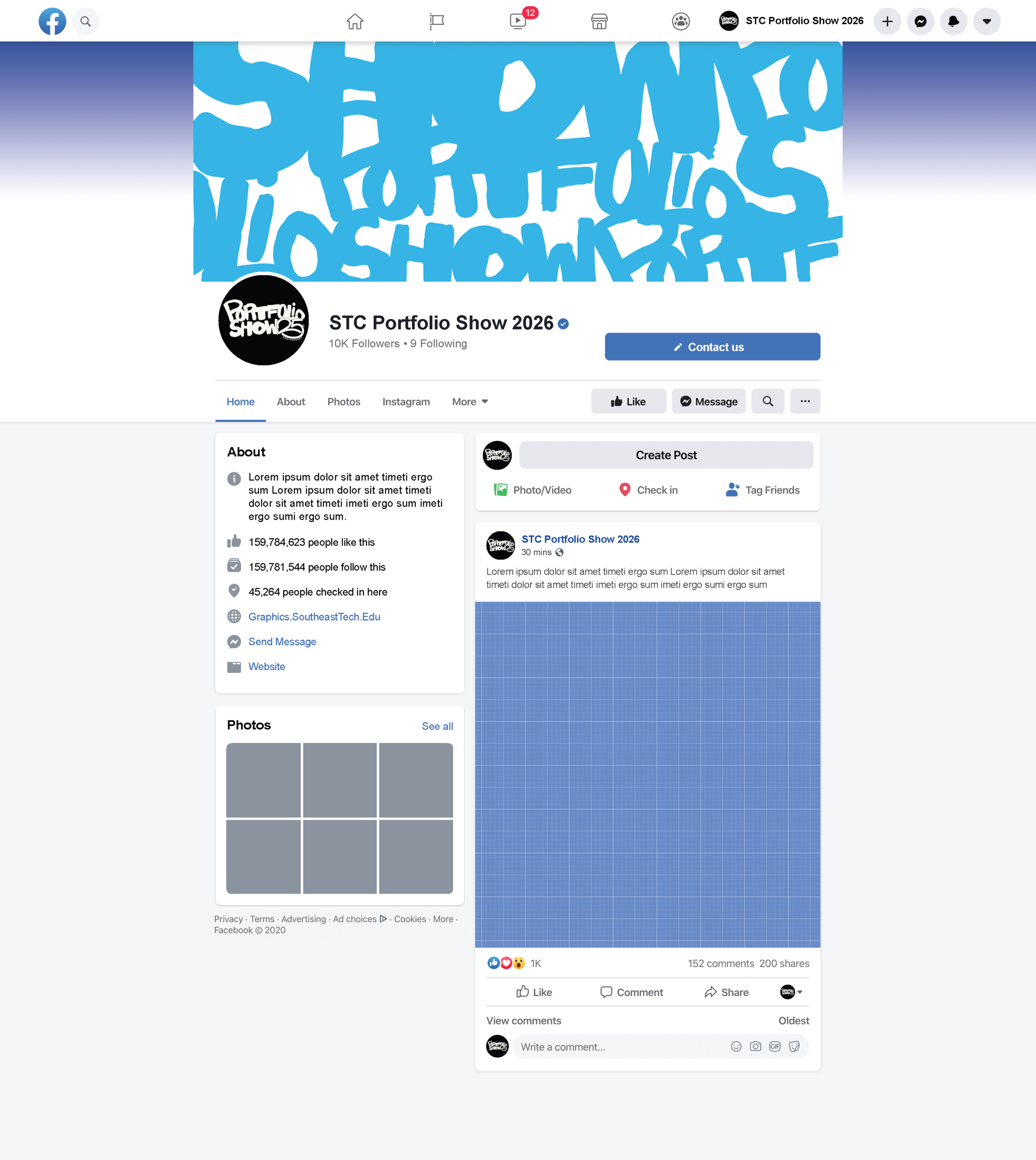
Obviously, we can’t change the exact look of Facebook to suit our themes and big ideas, but we can work with what they give us.
We make the profile picture the simplified black background logo to draw attention by contrasting the rest of our look and the web page as a whole.
Our banner will be the interconnecting words of the poster to provide that contrast to the profile picture.
Website Mock-up
Here’s where we pull from our inspiration and put our own spin on it.
Big portfolio show logo on the landing page. It has those stark color contrasts, but easy on the eyes. It’s taking up most of the screen, but not all. At the bottom is our nav bar peaking out.
As mentioned before, I like huge images taking up space, but I don’t like it when they take up ALL the space. It makes it a little disorienting, and the viewer can lose their place, especially if there are multiple images.
The nav bar is simple and quick to the point. Below that would be a small paragraph explaining the event with our school logo next to it to show ownership.
Then would follow the students along with their names. Since our classes are relatively small, I don’t think including all the students here would be a bad idea. Although we have to be VERY aware of scroll exhaustion. Thats why I wanted to add a “Students” page where the viewer can view by major.
We keep with the overall theme by sticking to colors and having fun animations along with the same hand-placed text.