
A designers most time-consuming hobby is finding suitable fonts. I am no stranger to scrolling on adobe fonts, dafont, or myfonts trying to find something interesting. Here are some that I’ve discovered that will for sure sit in your favorites for all eternity!

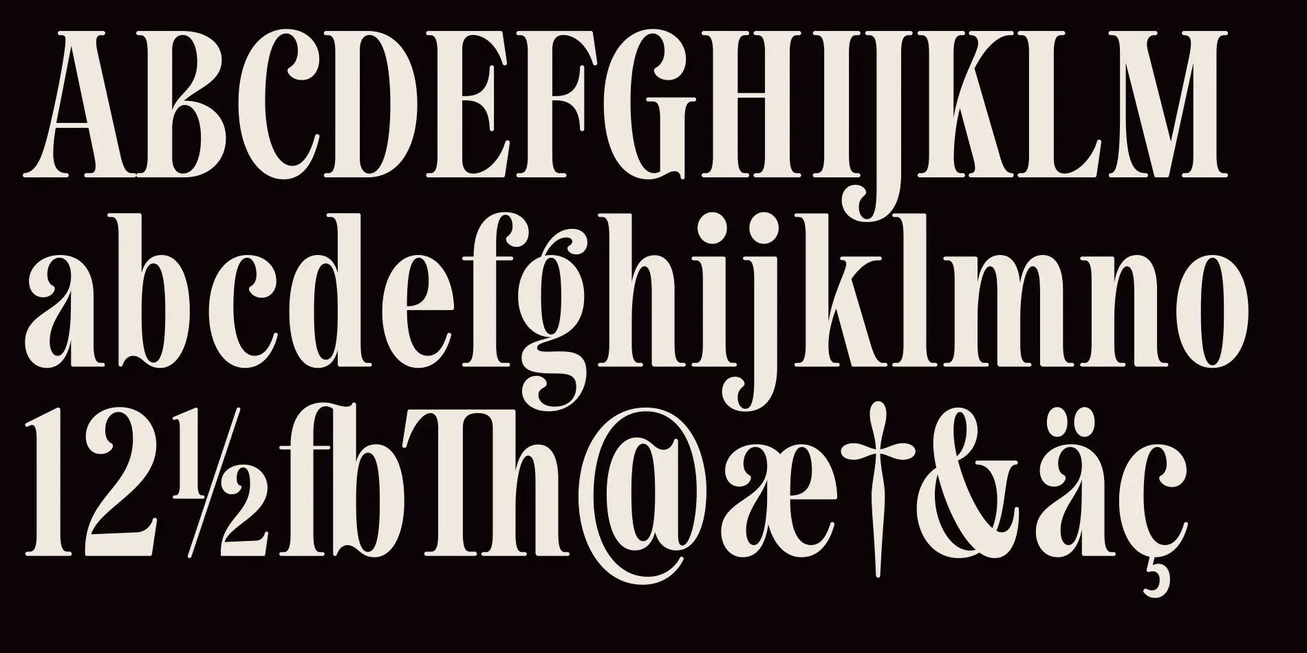
Benton Modern Display by Dyana Weissman and Richard Lipton
I am a big fan of thin and clean looking fonts, but they must be serif!!! As to not run the risk of being mistaken for a Rae Dunn font #derogatory. The only good thing a Rae Dunn font was in was Poor Things. Anyways, I enjoy this font because its comes in a very large array of styles so it can be used in a variety of situations. We use serifs mostly for body copy so it can be a real treat when we can use different styles of the same font so we’re not so boring!

Luke by Hidetaka Yamasaki
Blackletter typefaces will always have a special place in my heart. It reminds me of the gothic things that I am very drawn to. This one in particular, just like the last, has several styles. 12 to be exact. And some of them have a fun 2-tone effect (see below). Highly stylized fonts like this only have a number of real-life use cases. Such as word-mark, emphasis, art, or titles. Basically, if we stick within the standards of design we use fonts like these only a few times.

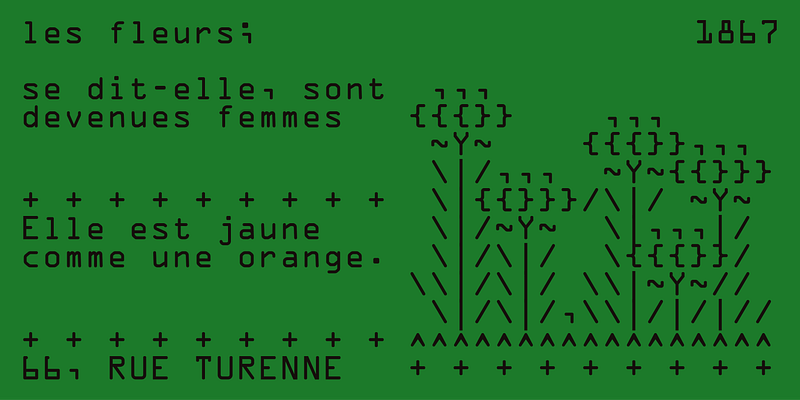
OCR A by American Type Founders
Now here is a good mix between style and readability!!! Very cool retro-futuristic kinda look going on here. And I love that the designer included ASCII art they made with their own font! I think this could be used for mostly anything in a design; but still maybe not for large paragraphs of text since it is sans-serif, so it could be a bit harder to read. Playing with the font color is fun also; if we use a black background with green text it could emulate an old terminal. Many fun use cases with this one.